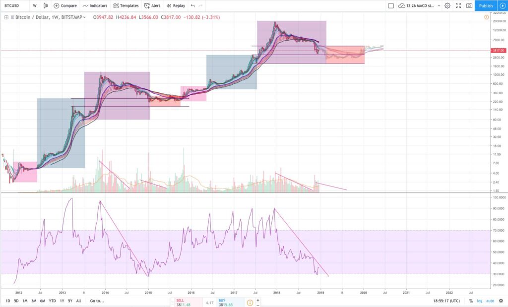
BTC 2016 – 2018 fue en muchos sentidos un fractal de BTC 2012 – 2014. ¿Seguirá funcionando el patrón o algo va a cambiar?
Entonces, en primer lugar, nadie sabe si esto seguirá sucediendo, esa pregunta era retórica. Podemos conocer la historia, no podemos conocer el futuro. Entonces, dejemos esa pregunta a un lado.
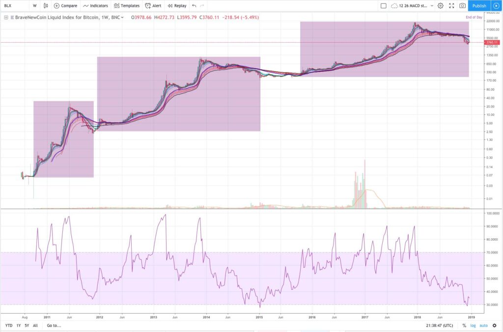
En segundo lugar, no solo 2012-2014 es un fractal de 2016-2018 … sino que, al observar el índice de líquido BraveNewCoin, se puede ver que 2010-2011 es esencialmente un fractal de 2012-2014 y 2016-2018 (consulte la tabla a continuación para ver una visual).
Cuando uno lo mira de esta manera, queda claro que cada fractal se está desarrollando, pero está tardando cada vez más en desarrollarse.
Dicho todo esto, lo más interesante de este patrón es cómo cada ciclo se compone de secciones notables.
He codificado por colores las secciones anteriores.
You have the pink section where the first breakout occurs and where the “luckiest” have accumulated their coins by, the blue section where the first round of excitement hits (historically it has been safe to enter here and HODL), and then the purple box of euphoria and doom where the last parabolic lift-off and then the subsequent bear market occurs.
In between this all, in the red section, we get an accumulation period in which media attention and hype dies down while “smart money” accumulates.
You can see in the chart above I’ve added some potential price action for 2019. The idea here isn’t to give targets, instead I simply copy and pasted the price action from 2015 onto 2019 to show what it might look like if the fractal played out. Please don’t interpret that as some mandate that we have to go up, down, or sideways.
Lastly, on the chart above you’ll notice I marked off some additional patterns. 1. Notice how the red box and blue box line up, it wasn’t like this in 2010 – 2011, was in 2012 – 2014, and we don’t know yet for 2016 – 2018, 2. Notice the pattern in volume and RSI. This seems to be repeating as well. In 2014 – 2015 the second time RSI reached 30 was the bottom. In 2018 we reached RSI 30 once. Will we reach it a second time in 2019 to form a bottom, thus creating a near perfect fractal? I don’t know, but will be interesting to watch.
NOTE: Below is the full chart from 2010 – 2018. The reason I didn’t analyze this one above is because zooming out like that makes some of the patterns harder to see (plus the volume is a little strange from this data set). Anyways, this does however clearly show the 3 fractals, each taking longer and longer to occur, each having a bigger accumulation period in between, and each being slightly less impressive looking on a logarithmic chart (which makes sense given how real dollar amounts are represented on a logarithmic chart despite what John McAfee might assert). Still, is this overall pattern pointing at a 4th fractal, I think the logic is there… but again, I can’t see the future.

Fractal BTC 2010 – 2018

